C9 Call To Action Block
This block can be placed in a C9 Grid block, or used on its own within a page or post. Specifically, this can be linked to a form, shopping cart, or modal to push users to do something. Sign up for your emails, fill out a lead form, or make a reservation/booking.
C9 Call To Action Block Settings
Content Width
This defines the column width for the Call To Action Text. Our default call to action bar layout has the text on the left, and the button with a link on the right. We typically recommend putting this block inside of a C9 Grid.
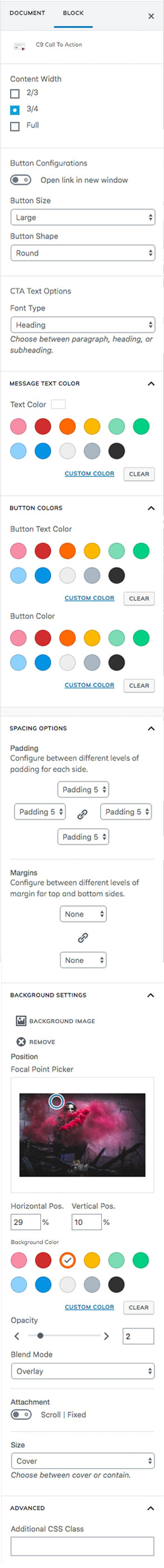
- 2/3 width of container
- 3/4 width of container
- Full width of container
Button Configurations
Open Link in New Window
This is disabled by default for accessibility purposes.
Button Size
Small, medium, large, and extra large. Medium by default.
Button Configurations
Button Shape
Square, round and outline.
CTA Text Options
Font Type
Paragraph, heading or subheading. Paragraph by default. Results will vary by theme. The C9 Theme uses the same font-family for the heading and subheading, but has CSS classes for each.
Message Text Color
Text Color
Select from pre-saved colors or a custom color.
Button Colors
Button Text Color
Select from pre-saved colors or a custom color.
Button Color
Select from pre-saved colors or a custom color.
Spacing Options
Padding
Set the Bootstrap padding class on the inside of the outer container. Choose from any of the available settings here. This adds visual padding to the inside of the outer container and is set to Padding 5 by default. To set separate padding classes for each drop down, click on the chain icon to unlink them.
Margins
Set the top and bottom Bootstrap margin class. Click the chain link to set different margins for each. This will add spacing to the outside of the Call To Action Bar container. This means the background may be seen above and below this section.
Background Settings
Background Image
Select a photo, pattern, or texture to use as the background for the call to action bar.
Focal Point Picker
Click and drag the circle on screen to select the part of the image where your focal point is, and you’ll notice the horizontal and vertical position update as you drag/drop the picker.
If you don’t see the image moving in your editor, make sure you change the Size attribute to custom should you need to scale the image up or down.
Attachment
Scroll is the default so the image moves when the user scrolls. Select Fixed to have the background image remain in place as the user scrolls the content past it.
Color Overlay
This layer allows you to select a color, opacity, and blend mode to put an overlay on top of your background videos and photos. This can allow for text to be easier to read, or to change the colors and effects of your background imagery.
Opacity
Used in conjunction with color overlay to make the background semi-transparent or completely opaque.
Blend Mode
Change the color overlay background color blend mode for applying different filters to photos.
Advanced
Additional CSS Class
Use this block to add a custom CSS class to the outer container element for the Call To Action block. This allows you to write your own custom CSS for specific sections of the site, and is supported by most of the C9 Blocks.
Call To Action Block Walk Through Video
This block works best inside of a C9 Grid block, but it can also be used on its own directly on the editor like we’ve shown in the video to the right. We also walk through the other settings outlined above.