C9 Posts Grid Block
Need a unique blog posts layout? How about a way to display any of your post types in a grid? You’ve come to the right place. This block displays posts of any type in a grid, and allows for customizations to the markup, thumbnails, columns, and even the post query itself.
C9 Posts Grid Settings & Responsive Containers
The posts grid uses a similar grid as the C9 Grid block except the content is limited to a post grid rather than all of the various C9 Blocks and WordPress core blocks. There are two components to the C9 Posts Grid block, an outer container, which uses almost the same classes and CSS as the C9 Grid block, and an inner container that has its own settings for backgrounds. The inner container can be configured to have containers that are the default Bootstrap width of 1140px, a narrower container setting of 960px, a wide 1200-1260px width, or full viewport (vw) width alignment as Gutenberg makes use of. This may be theme dependent, but the C9 Theme follows this configuration exactly on the frontend.
The second component of the C9 Posts Grid is the inner container, where the posts content is displayed that also has its own set of internal settings. The outer container has a minimum Window Height setting, should you need to center a grid of content in a container, and they both have Background settings that are pretty similar. Details for the settings for both the outer container, inner container, and post markup and content for the posts grid are documented below.
Outer Container Settings
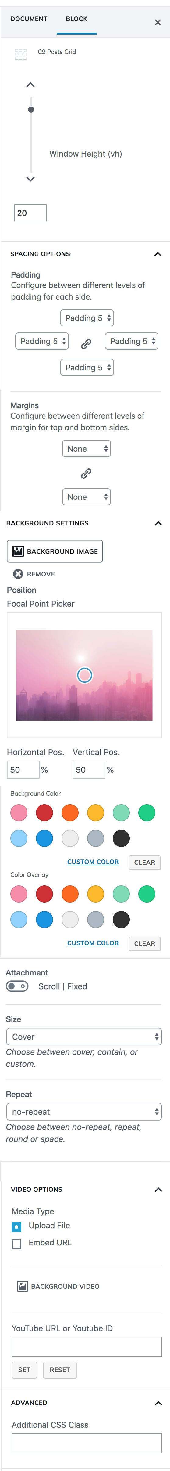
Window Height (vh)
Despite looking like a complex mathematical equation, vh is really just short for “viewport height.” Use this setting to set the minimum height of the current C9 Posts Grid block row. We frequently use this to set a large height to allow for vertical space in the background imagery and videos.
Spacing Options
Padding
Set the Bootstrap padding class on the inside of the outer container. Choose from any of the available settings here. This adds visual padding to the inside of the outer container and is set to Padding 5 by default. To set separate padding classes for each drop down, click on the chain icon to unlink them.
Margins
Set the top and bottom Bootstrap margin class. Click the chain link to set different margins for each. This will add spacing to the outside of the C9 Posts Grid outer container. This means the background may be seen above and below this section.
Background Settings
Background Image
After uploading a background image, whether it’s meant to be used as a pattern, a fullscreen background image, or as an image positioned somewhere else on screen, you’ll notice a few additional settings that display including a Focal Point Picker. We recommend using 1700px wide graphics for background photos, and for background patterns and images we recommend using at least 144dpi images so they look crisp on higher resolution displays.
What background element is on top of which in the z-index of the dom?
There are four layers to backgrounds in our grid components. Beginning with the bottommost layer, the background color, each background component is placed on its own in the z-index so you can get a variety of useful background effects like blend modes over videos, or color overlays over textured patterns, or simply a photo with a smokey overlay so text can be placed on the container on top of it for a header file like many of our saved templates.
- Background Color
- Background Image
- Background Video
- Color Overlay
Focal Point Picker
Click and drag the circle on screen to select the part of the image where your focal point is, and you’ll notice the horizontal and vertical position update as you drag/drop the picker.
If you don’t see the image moving in your editor, make sure you change the Size attribute to custom should you need to scale the image up or down.
Attachment
Scroll is the default so the image moves when the user scrolls. Select Fixed to have the background image remain in place as the user scrolls the content past it.
Background Color
Select with a color picker, or choose a custom color from your saved color settings for a background color. The background color shows up below the background image.
Color Overlay
This layer allows you to select a color, opacity, and blend mode to put an overlay on top of your background videos and photos. This can allow for text to be easier to read, or to change the colors and effects of your background imagery.
Opacity
Used in conjunction with color overlay to make the background semi-transparent or completely opaque.
Blend Mode
Change the color overlay background color blend mode for applying different filters to photos.
Mobile Background
Same as desktop or override settings
If you need to change the position, size, or focal point of the background image image on mobile, enable this setting and override the settings you need to have different mobile background positioning.
Video Options
Embed File
Upload a small video clip for a background video. We’d recommend something that’s optimized in the MP4 format.
Embed URL
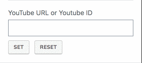
You can enter in a link to a YouTube video here and hit set, and the field will be set to the video ID of the YouTube video, and should show up in the background of your container grid once you do so. By default, our videos loop, they fade in, and they’re also muted. Nobody wants auto-playing music on a website. Period.
Advanced
Additional CSS Class
Use this block to add a custom CSS class to the outer container element for the C9 Grid block. This allows you to write your own custom CSS for specific sections of the site, and is supported by most of the C9 Blocks.
Inner Container Settings
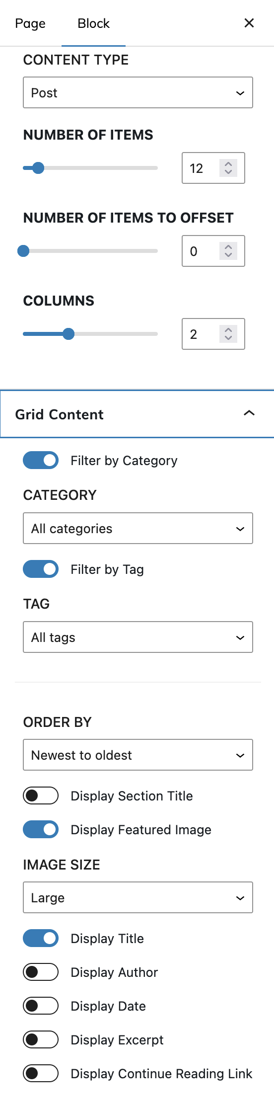
Content Type
Select the post type that you’d like to display in the inner grid. By default, this will be your posts, so if you haven’t created any blog post content, then you will see an empty grid when adding the inner container.
Order By
What order do you want the posts to display in? Newest posts are displayed by default.
Category
Limit the posts by a specific category.
Tag
Limit the posts by a specific tag.
Number of items
How many number of posts do you want to display in the grid. Defaults to 12 so it displays in the most optimum grid on all devices.
Number of items to offset
Offset your posts by the number selected here. When this is set to a number other than zero, the number is how many posts it will skip in the grid. (So if it is set to 1, the most recently posted item will not be displayed until a new item has been published.)
Columns
How many columns would you like to display in the grid of content? Defaults to two columns and goes all the way up to 4. It is also possible to have a single column by changing Columns to 1.
Post And Page Grid Content
Display Section Title
Display a heading at the top of the posts grid
Display Featured Image
Display the posts featured image
Image Size
Select which thumbnail image you’d like to display with the grid. To make the plugin compatible with other themes, this has been set to Large by default, but can be changed to any of your themes registered thumbnails as you can see in the screen recording at the top.
Display Title
Displays the post title
Display Author
Displays the author of the post
Display Date
Displays the posts date of publication
Display Excerpt
Displays a custom length post excerpt
Display Continue Reading Link
Display a “continue reading” message. (This can be customized)
Post And Page Markup
Post Grid Section Tag
Change the post grid section tag to match your content hierarchy. This means you can customize the HTML selector surrounding the section tag to match your content hierarchy for SEO purposes.
Section Title Heading Tag
Change the heading HTML element size for the title of the post grid. The lower the number, the more SEO emphasis the heading will have on your page. For more, you’ll have to study some SEO blogs as this has very degrees of success.
Post Title Heading Tag
Change the heading to each individual post to match up with your CSS or content hierarchy.
Spacing Options
Padding
Set the Bootstrap padding class on the inside of the outer container. Choose from any of the available settings here. This adds visual padding to the inside of the outer container and is set to Padding 5 by default. To set separate padding classes for each drop down, click on the chain icon to unlink them.
Margins
Set the top and bottom Bootstrap margin class. Click the chain link to set different margins for each. This will add spacing to the outside of the C9 Posts Grid outer container. This means the background may be seen above and below this section.
Color Settings
Background Color
Select with a color picker, or choose a custom color from your saved color settings for a background color. The background color shows behind the content container within the grid. We find that we’re typically giving content containers backgrounds when there is a pattern in the background and text is hard to read.
Opacity
Used to make the color semi-transparent on the content container.
Advanced
Additional CSS Class
Use this block to add a custom CSS class to the outer container element for the C9 Grid block. This allows you to write your own custom CSS for specific sections of the site, and is supported by most of the C9 Blocks.