C9 Toggles
Toggle blocks are a great place to store answers to questions, directions to an event, or additional information about a product or service. C9 Toggles block has a small and a large style
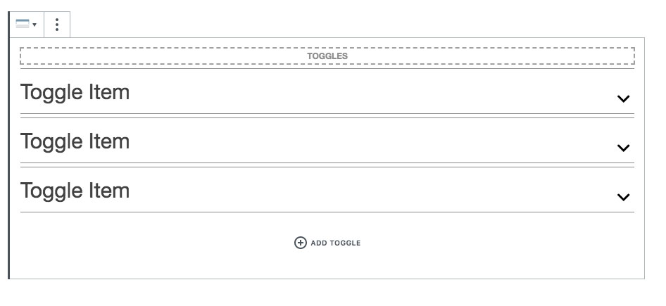
Selecting the parent toggle container
When hovering over the outer edges of the toggles you should see a dashed selector display like in the screen shot, clicking on this will select the outer Toggle element and display the settings you see below.
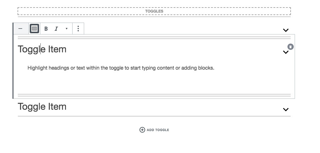
Toggling/opening individual toggles
Clicking on the square “opened” toggle button like you see below, or clicking on the arrows will open the toggle items in the blocks editor window. Users can select the entire toggle heading to open the toggles on the frontend.
Toggle Settings
Styles
Tabs come in a Default (large) and a Small style each with their own design styles when expanded or collapsed. We use FontAwesome icons for the toggle icons.
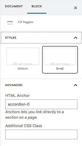
Advanced
HTML Anchor
If you have ever wanted to link directly to a section on the page, you can add in a CSS ID here such as “page-section-media” and then use a direct anchor link to yoursite.com/page-name/#page-section-media and be taken directly to the top of your anchor item.
Very helpful for creating on-page navigation with multiple sections on a page.
Additional CSS Class
Add a custom CSS class for additional styling or customization.
Toggles Settings Walk-through Video
Seeing someone go through the settings is easier than reading through documentation.