C9 Grid Block
Websites don’t need to all be centered headlines with gigantic BUY NOW buttons. The C9 Grid block is the start of just that. Inside this block is a container for repeatable rows of content, which can be split into columns, and are responsive by default.
The outer C9 Grid block supports multiple background options including color, photo, pattern, and videos from YouTube or file upload.
C9 Grid Settings & Responsive Containers
The responsive grid container, or C9 Grid block is the primary layout block we use for most of the section and page templates you can find when you click on the feather icon. This block’s code is what magically makes the landing pages stack into nice columns on even the tiniest of phones users may be accessing your site on.
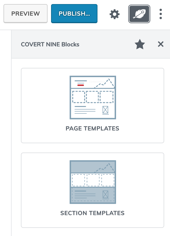
Most importantly, with the flexibility from our columns, rows, and alignment tools, designers can now break up designs into more effective layouts. Don’t get too excited, but that means non-standard grids with columns of varying sizes and alignments can now be configured with relative ease, or if you’re incredibly lazy like we are, you can start out with some of the templates we provide from within the section templates or page templates modal because making all these decisions is putting this introvert to sleep!
The best part of responsive grids, with the help of our C9 Starter Theme, you’ll never have to worry about how your precious layouts will look on mobile phones when your boss calls because the blocks will stack into smaller columns and the theme will make your fonts just a TEENSY bit smaller to fit.
How does it work?
There are two components to the C9 Grid block: an outer container, which uses most of the same classes and CSS as the C9 Posts Grid block, and an inner container that has its own settings for backgrounds, container width, and vertical height/alignments. An inner container can have multiple rows and columns. Columns and rows can be filled with just about any WordPress block content such as video, forms, product catalogs, e-commerce stores, forums, and membership websites.
The term “container” comes from the Bootstrap framework. Many of our container styles are based on Bootstrap’s layout grid styles.
The outer container can be configured to have containers that are the default Bootstrap width of 1140px, a narrower container setting of 960px, a wide 1200-1260px width, or full viewport (vw) width alignment as Gutenberg makes use of. This may be theme dependent, but the C9 Theme follows this configuration exactly on the frontend.
The second component of the C9 Grid is the inner container, where almost any kind of content can be displayed.
Unlike the C9 Posts Grid, the C9 Grid‘s outer container and inner container have a minimum Window Height setting, should you need to center a grid of content in a container, and they both have Background settings that are pretty similar. You can see this in action on almost all of our section templates and page templates, and most notably in the design portfolio example in the Page Templates section of our modal.
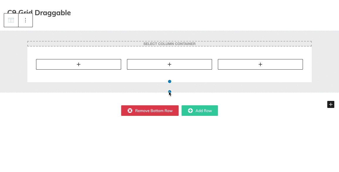
As of C9 Blocks v1.2, you can click on the blue dots on the inner C9 Column Container or the outer C9 Grid block to drag it’s height vertically as you see fit.
Reminder! C9 Grid works best as a top-level block.
You can try to fit the C9 Grid in other elements like carousels, but it’s meant to be the first element that goes into the Gutenberg editor. Carousels do support the C9 Columns Container block should you need responsive columns inside a carousel.
Outer Container Settings
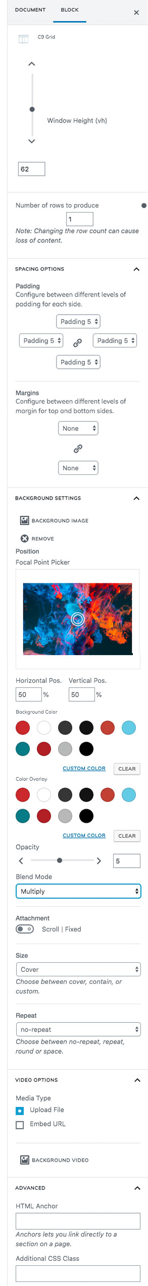
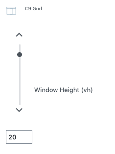
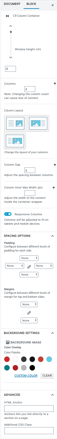
Window Height (vh)
Despite looking like a complex mathematical equation, vh is really just short for “viewport height.” Use this setting to set the minimum height of the current C9 Posts Grid block row. We frequently use this to set a large height to allow for vertical space in the background imagery and videos.
Number of rows to produce
Adds rows to the inner container. Defaults to one row. You can also add a row to your inner container at the bottom where it has add and remove buttons.
Spacing Options
Padding
Set the Bootstrap padding class on the inside of the outer container. Choose from any of the available settings here. This adds visual padding to the inside of the outer container and is set to Padding 5 by default. To set separate padding classes for each drop down, click on the chain icon to unlink them.
Margins
Set the top and bottom Bootstrap margin class. Click the chain link to set different margins for each. This will add spacing to the outside of the C9 Posts Grid outer container. This means the background may be seen above and below this section.
Background Settings
Background Image
After uploading a background image, whether it’s meant to be used as a pattern, a fullscreen background image, or as an image positioned somewhere else on screen, you’ll notice a few additional settings that display including a Focal Point Picker. We recommend using 1700px wide graphics for background photos, and for background patterns and images we recommend using at least 144dpi images so they look crisp on higher resolution displays.
What background element is on top of which in the z-index of the dom?
There are four layers to backgrounds in our grid components. Beginning with the bottommost layer, the background color, each background component is placed on its own in the z-index so you can get a variety of useful background effects like blend modes over videos, or color overlays over textured patterns, or simply a photo with a smokey overlay so text can be placed on the container on top of it for a header file like many of our saved templates.
- Background Color
- Background Image
- Background Video
- Color Overlay
Focal Point Picker
Click and drag the circle on screen to select the part of the image where your focal point is, and you’ll notice the horizontal and vertical position update as you drag/drop the picker.
If you don’t see the image moving in your editor, make sure you change the Size attribute to custom should you need to scale the image up or down.
Attachment
Scroll is the default so the image moves when the user scrolls. Select Fixed to have the background image remain in place as the user scrolls the content past it.
Background Color
Select with a color picker, or choose a custom color from your saved color settings for a background color. The background color shows up below the background image.
Color Overlay
This layer allows you to select a color, opacity, and blend mode to put an overlay on top of your background videos and photos. This can allow for text to be easier to read, or to change the colors and effects of your background imagery.
Opacity
Used in conjunction with color overlay to make the background semi-transparent or completely opaque.
Blend Mode
Change the color overlay background color blend mode for applying different filters to photos.
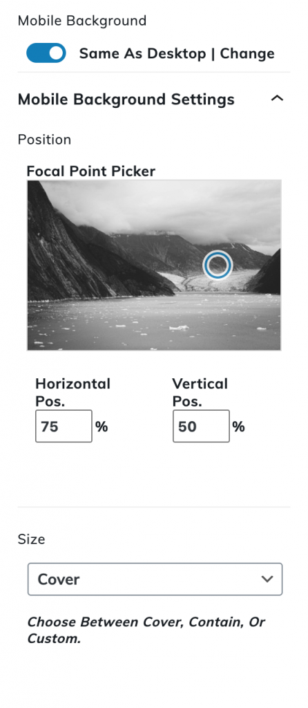
Mobile Background
Same as desktop or override settings
If you need to change the position, size, or focal point of the background image image on mobile, enable this setting and override the settings you need to have different mobile background positioning.
Tell the background image to scale itself up to the available space by setting it to cover, or set a custom size to orient the background image while maintaining a fixed size on mobile.
The focal point picker will allow you to select the position of the background for mobile devices either by using the chosen focal point of the image, (When background Size is set to cover) or by orienting the custom image size around in the available canvas space. (When the background Size is set to contain or custom)
Video Options
Embed File
Upload a small video clip for a background video. We’d recommend something that’s optimized in the MP4 format.
Embed URL
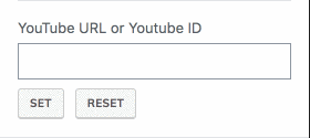
You can enter in a link to a YouTube video here and hit set, and the field will be set to the video ID of the YouTube video, and should show up in the background of your container grid once you do so. By default, our videos loop, they fade in, and they’re also muted. Nobody wants auto-playing music on a website. Period.
Advanced
HTML Anchor
If you have ever wanted to link directly to a section on the page, you can add in a CSS ID here such as “page-section-media” and then use a direct anchor link to yoursite.com/page-name/#page-section-media and be taken directly to the top of your grid.
Very helpful for creating on-page navigation with multiple sections on a page.
Additional CSS Class
Use this block to add a custom CSS class to the outer container element for the C9 Grid block. This allows you to write your own custom CSS for specific sections of the site, and is supported by most of the C9 Blocks.
Inner Container Settings
Options on Block
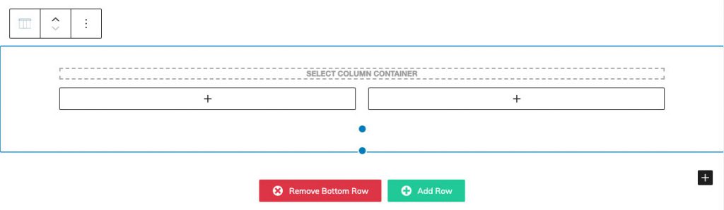
Select Column Container
Focus on the column container so you can changes options specifically for the block between outer container and blocks.
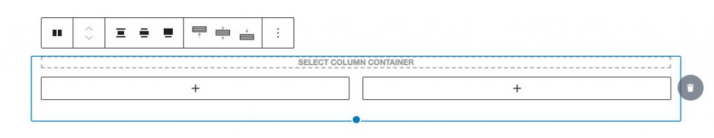
Add/Remove Row
Remove rows by clicking on the trash can to the right of the container after selecting the column container.
C9 Container Grid Row Movement
Select the column container you’d like to move, and then select the plus or minus buttons next to the grid icon in the block toolbar
Sidebar Options
Window Height (vh)
Select the post type that you’d like to display in the inner grid. By default, this will be your posts, so if you haven’t created any blog post content, then you will see an empty grid when adding the inner container.
Columns (max=6)
Choose column number (per row).
Column Layout
Choose from a few options to control relative column widths.
Column Gap (max=10)
Adjust the spacing between columns.
Column Inner Max Width (px)
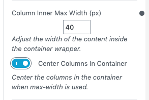
Adjust the width of the content inside the container wrapper.
Contains additional boolean: Center Columns in container
Responsive Columns
How many columns would you like to display in the grid of content? Defaults to two columns and goes all the way up to 4. It is also possible to have a single column by changing Columns to 1.
Spacing Options
Padding
Set the Bootstrap padding class on the inside of the outer container. Choose from any of the available settings here. This adds visual padding to the inside of the outer container and is set to Padding 5 by default. To set separate padding classes for each drop down, click on the chain icon to unlink them.
Margins
Set the top and bottom Bootstrap margin class. Click the chain link to set different margins for each. This will add spacing to the outside of the C9 Posts Grid outer container. This means the background may be seen above and below this section.
Color Settings
Background Color
Select with a color picker, or choose a custom color from your saved color settings for a background color. The background color shows behind the content container within the grid. We find that we’re typically giving content containers backgrounds when there is a pattern in the background and text is hard to read.
Opacity
Used to make the color semi-transparent on the content container.
Advanced
Additional CSS Class
Use this block to add a custom CSS class to the outer container element for the C9 Grid block. This allows you to write your own custom CSS for specific sections of the site, and is supported by most of the C9 Blocks.
HTML Anchor
If you have ever wanted to link directly to a section on the page, you can add in a CSS ID here such as “page-section-name-of-your-section” and then use a direct anchor link to
yoursite.com/page-name/#page-section-name-of-your-section
and be taken directly to the top of your grid with that ID.
Very helpful for creating on-page navigation with multiple sections on a page either to an inner container, or on the C9 Grid outer container itself. Both can be given unique IDs and linked to from the Navigation Links or Appearance > Menus part of the WordPress Menu.